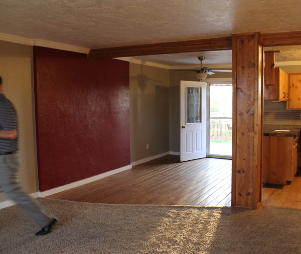
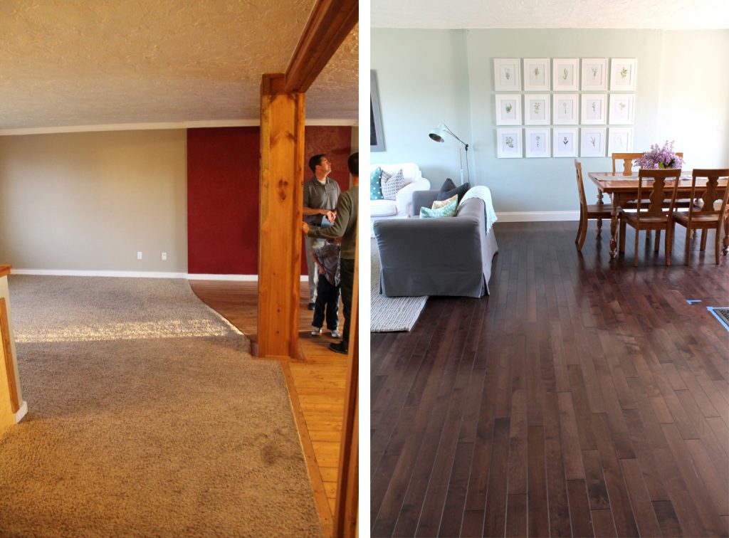
Ah, remember the awkward beam in the middle of the room?
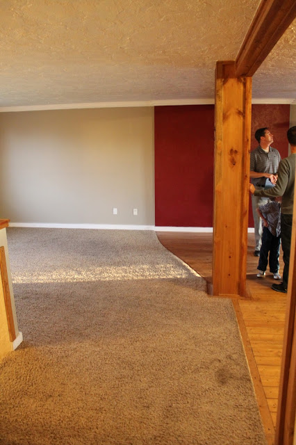
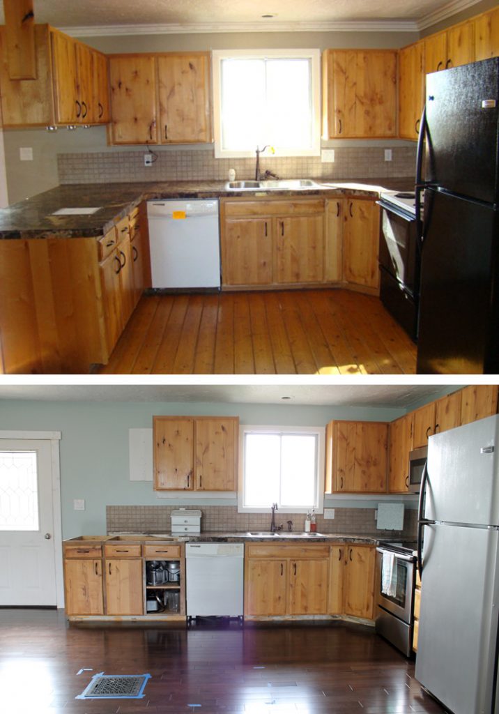
Here’s our kitchen before:
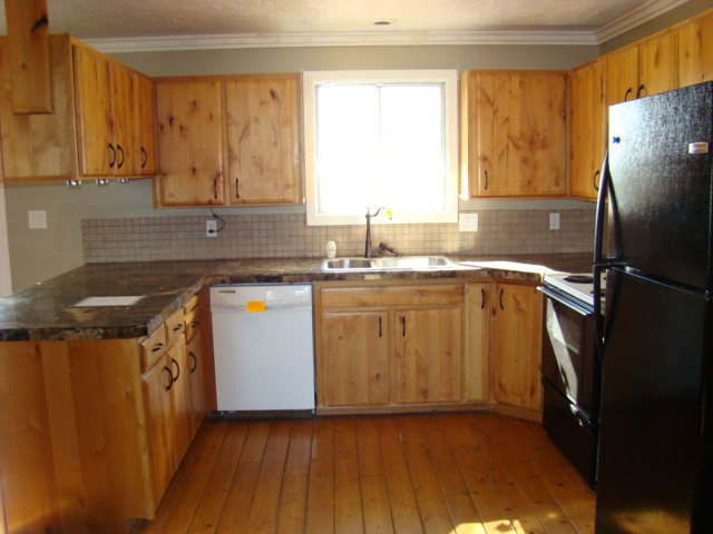
And when we first moved in and painted the fridge with stainless steel paint (still looks perfect by the way):
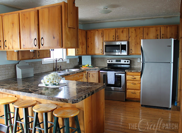
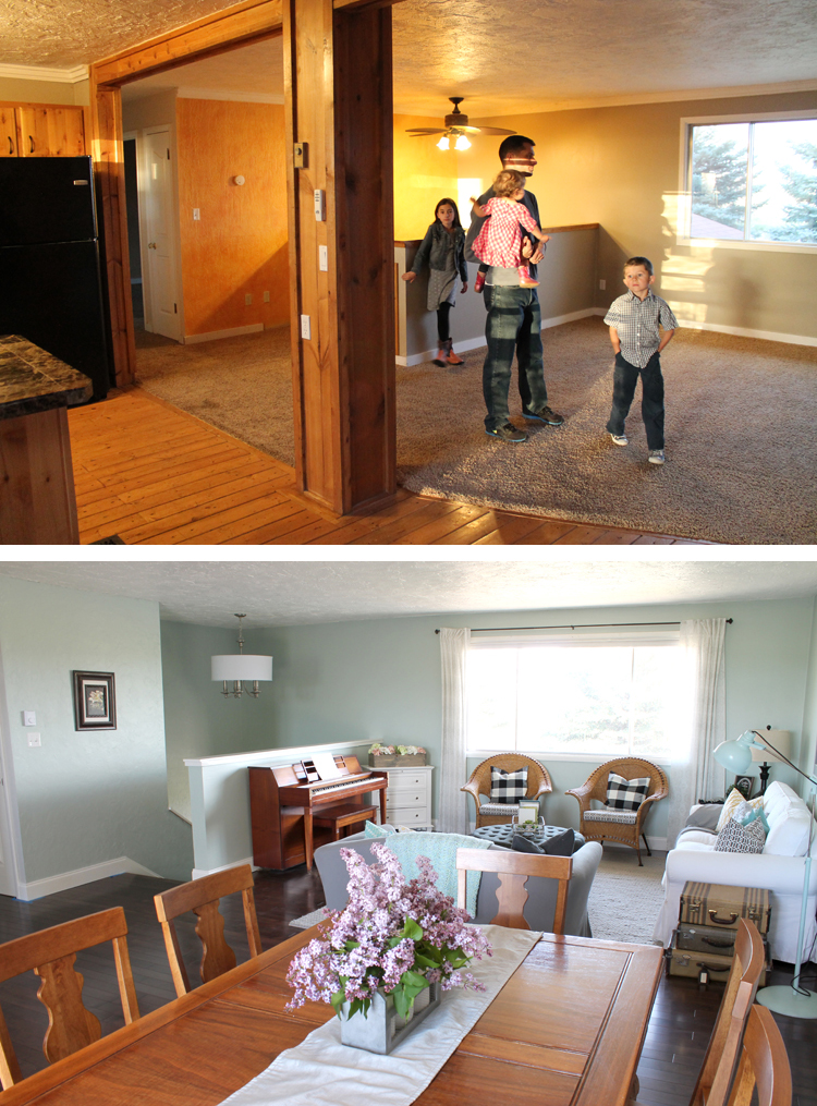
From the dining room looking out. Gag… the nacho cheese wall before we built the walk-in pantry:
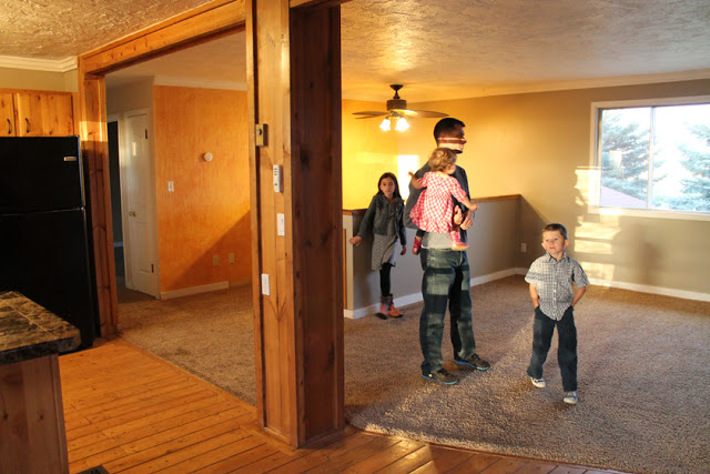
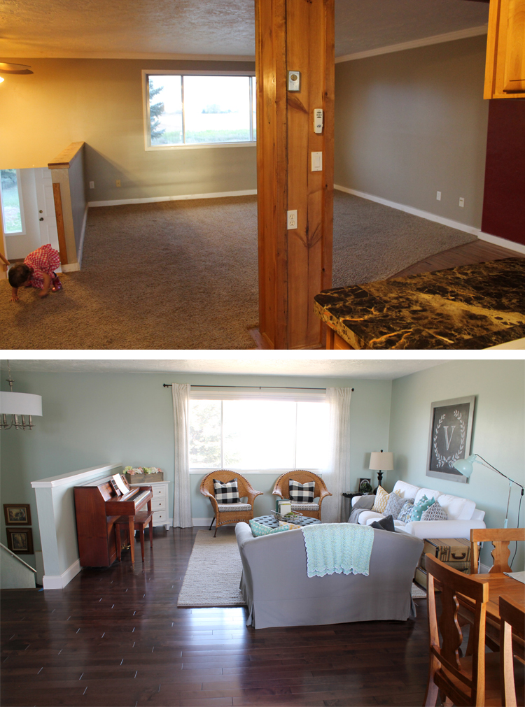
The living room:
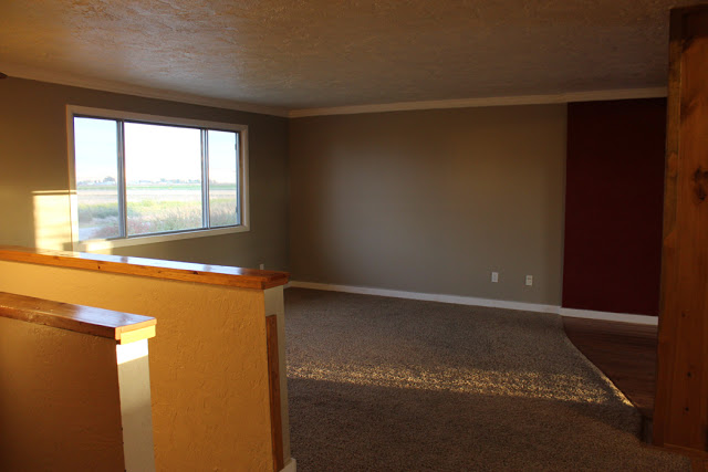
And here’s a more recent photo showing the ugly old flooring and the pillar and beam that really cut the room in half:
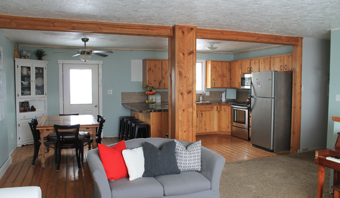
This is what the space looks like today:
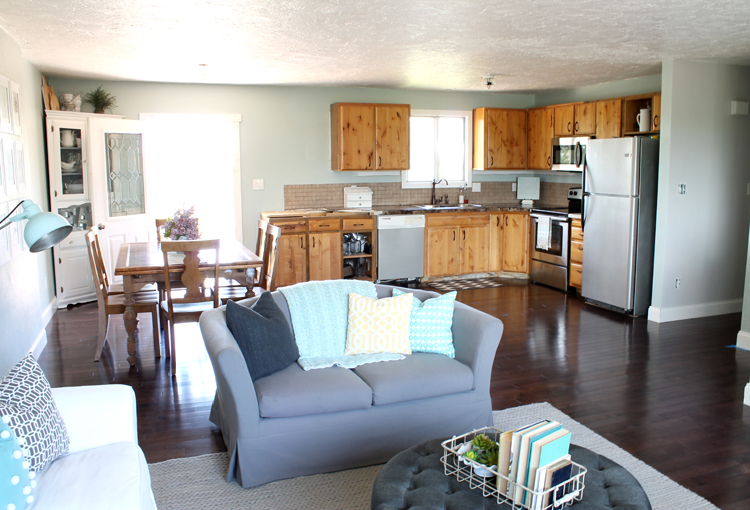
Ahhh! Cue angelic singing!
We removed the pillar (not load bearing), rewired some electrical, and had a heck of a time patching the ceiling and making the texture blend. That one change really made a huge difference in the feel of the room. It feels 10x bigger now!
You can tell from the pic that we haven’t gotten to the cabinets yet. That’s “Phase 2” of the project and we honestly are so burned out right now that we’re thinking we’ll wait until Fall.
We got new dining room chairs because I hated our old ones. I found these Better Homes and Gardens Cambridge Place chairs at Walmart online for such a steal that I felt completely justified. I sold our old chairs for $100 and the new chairs were only $240, so I got new chairs for $140. Boo-yah!
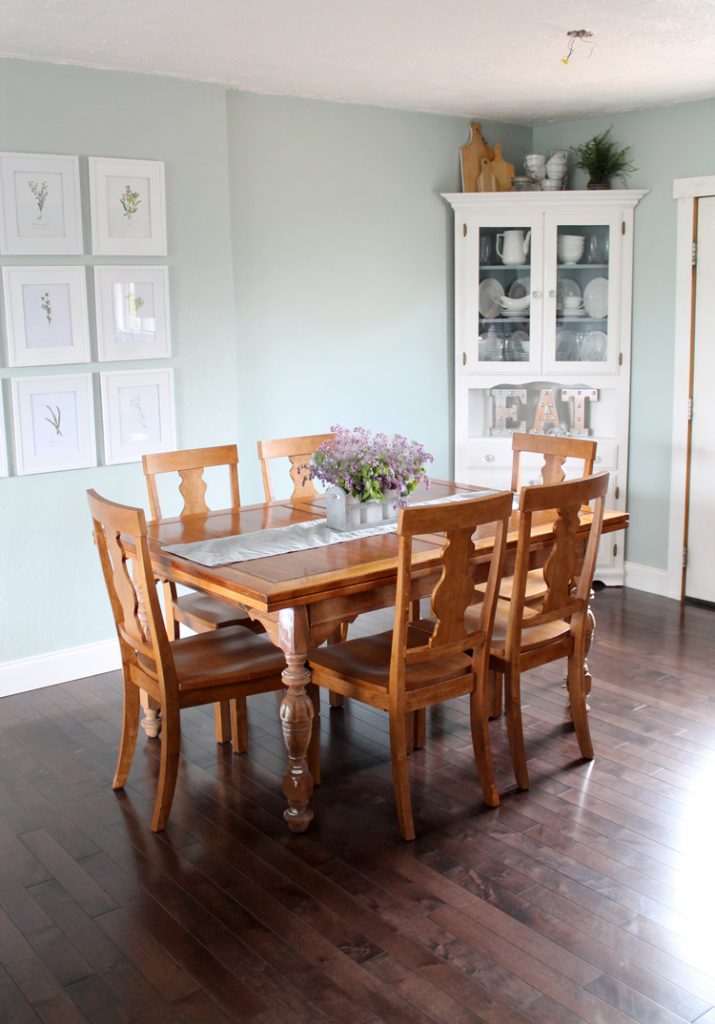
We plan to restain the table to be a more pleasing color. Next to the rich brown flooring, it looks SO yellow. I will paint the chairs (gray or the same color as the walls but a shade or two darker? Still deciding) and stain the seats to match the new table color.
I’m still in love with my botanical print gallery wall. It’s my favorite thing in the room.
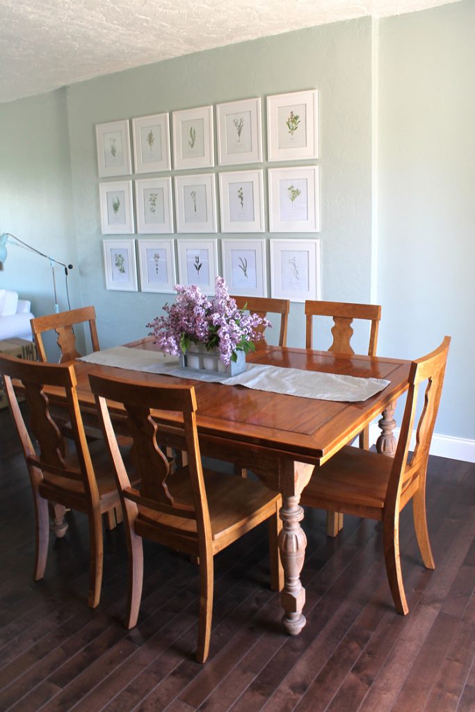
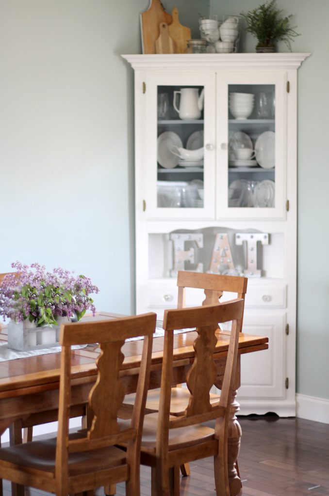
Wait, maybe the corner hutch is my favorite thing in the room. You should see the before pics. It used to be so ugly and now it’s the perfect place to display my pretty dishes and it fills that corner of the room so nicely.
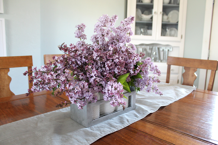
Lilacs in my farmhouse mason jar caddy. Watch for the tutorial for that coming soon! It’s my new favorite way to display flowers.
Don’t you wish lilacs bloomed all year? They smell so heavenly!
Here’s another view of the kitchen before we moved our furniture back in:
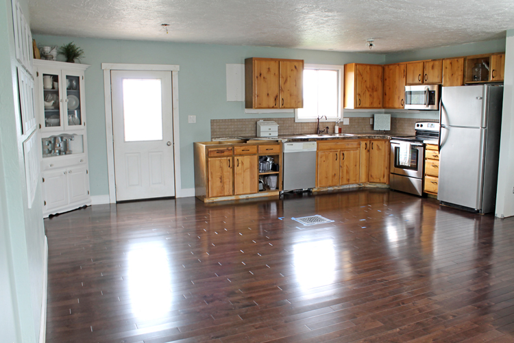
You can just barely see some blue tape on the floor in the kitchen. That’s where our island will go! I am loving the new layout of the kitchen already. Thanks for the encouragement to change it! It used to be U-shaped, but we ripped out the cabinets in the peninsula and turned them to be flat against the back wall. Best decision ever. We only lost one base cabinet (that was full of junk anyway) and when we put the island in, we’ll have three new base cabinets to take its place. The island will also give us a ton of extra counter space and a bar area so the kids can sit and talk to me while I cook.
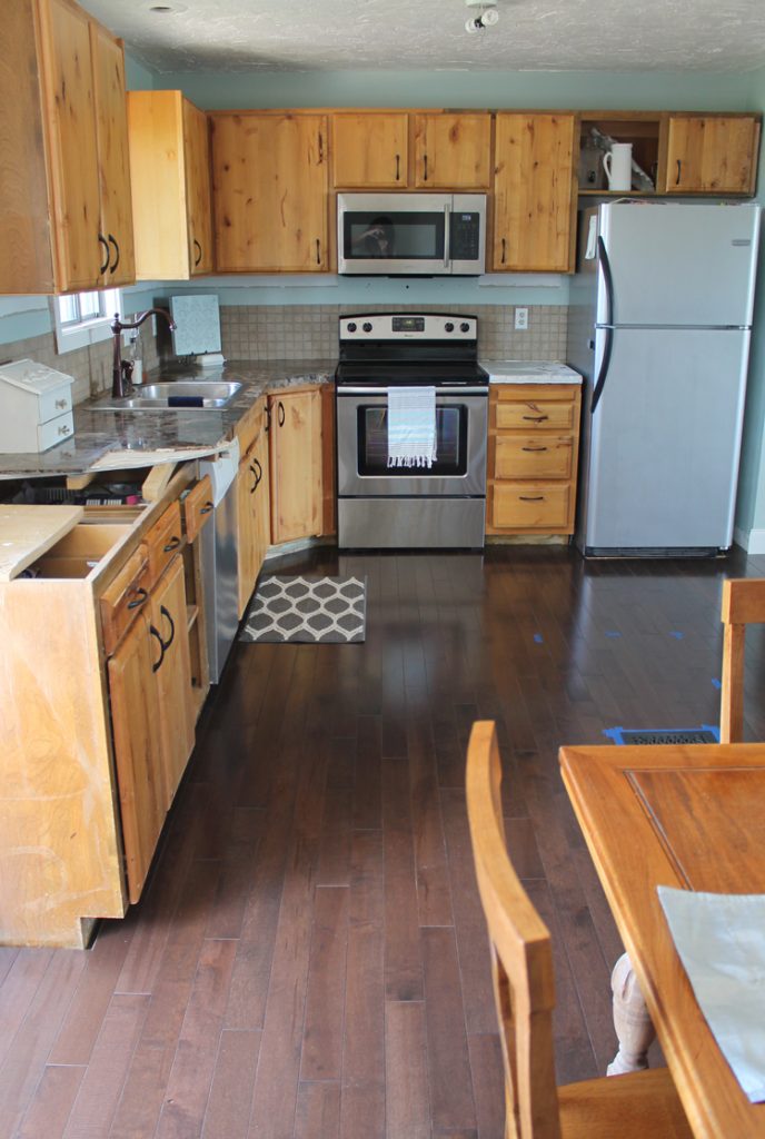
We’re living with crazy countertops for now, but we’ll get to Phase 2 when we get to it. Can I just talk about Phase 2 for a sec? I’ve planned it all out and I’m so excited!
Phase 2 plans:
- Fix the cabinets (obviously we’ve got doors missing), paint the cabinets white, build them up to the ceiling and add molding.
- Build a custom island with bar
- New trim around the back door (seriously, every time I see that back door molding I cringe! It’s so bad!)
- New lighting: pendant lighting over the island and a new dining room chandelier
- Backsplash that will go all the way up to the cabinets and then all the way to the ceiling where it’s open next to the back door. I’m thinking marble if we can splurge or subway tile if we need to save.
- Open shelving in the blank space next to the back door with tile behind it.
- Countertops. we’re thinking black and material is TBD.
We may also upgrade the dishwasher, fridge and sink depending on budget.
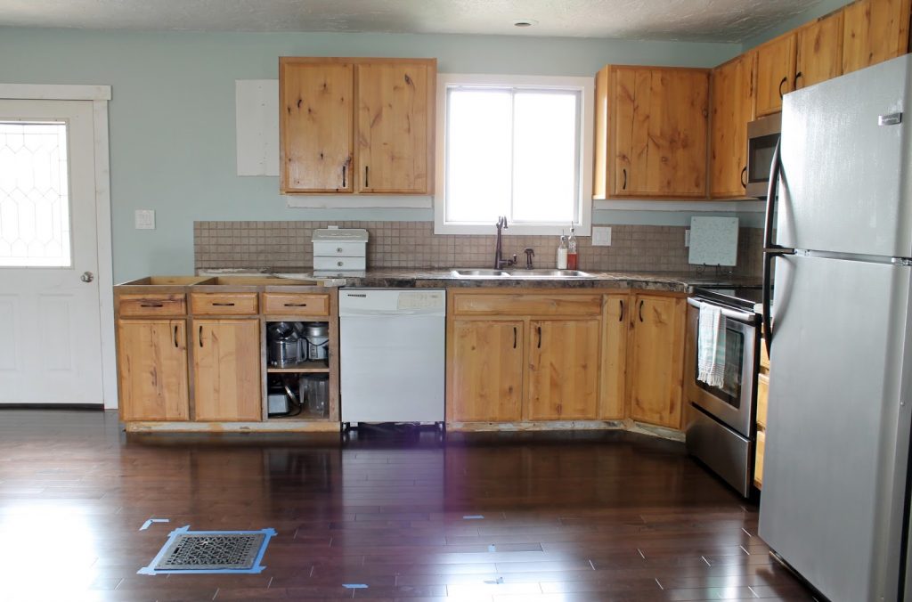
You can really tell in this next picture where the peninsula used to be. That floor vent will be under the new island. It pulls heat from the fireplace downstairs and we decided to leave it because we love the extra warm air in the winter.
Here’s the living room before we moved the furniture back in. Look at that gorgeous wood!

It’s Shaw brand maple and the finish is called Brandt Point Brown. THIS is the exact flooring we used. It is the prettiest wood! It’s hard to keep clean… every crumb and smudgie shows.
*** UPDATE: After living with these dark chocolate wood floors for the last 8 years, I wish we had picked something else. They are SO, SO hard to clean! The solid color and glossy finish are an absolute nightmare and it is by far the biggest regret I have with any remodeling we’ve done in this home. Please, please, please don’t buy this color of wood. As your internet friend, I have to try to talk you out of it.
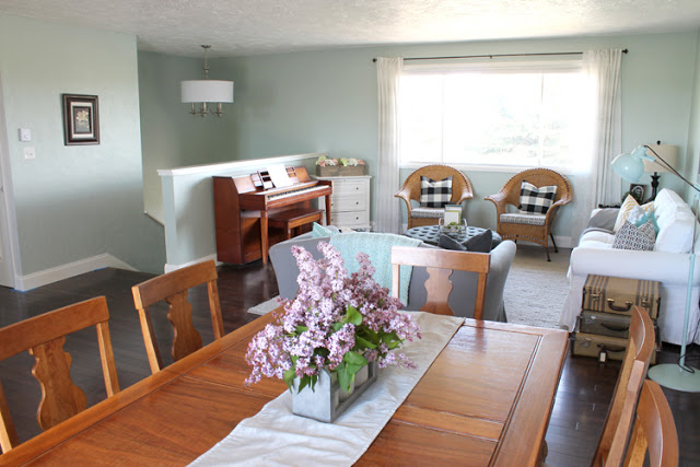
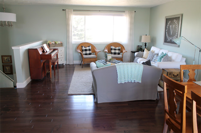
I really struggled picking out an area rug for the living room. I felt like I was choosing a new husband! I went to every store in town and didn’t see anything that I loved. The shopping is kinda crappy around here. So I started shopping online. Pretty quickly I realized that Rugs USA was going to be the place. Their prices are SO much better than anywhere else and they have a ton of cute options! That was part of the problem though… too many rugs I liked! In the end I decided that I wanted something neutral with lots of texture. I debated about getting the Maui Chunky Loop Rug, because it gets amazing reviews and is supposed to be super easy to clean, but even though people swear it’s soft, it’s still a jute rug and we do a lot of sitting on the floor in this room. So I went with an all-wool rug called the Textures Braided Rug in light gray. I LOVE the softness it adds to the room!
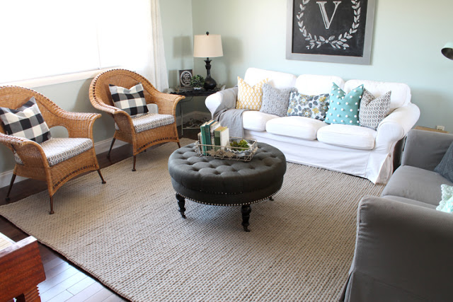
Here’s a close up:
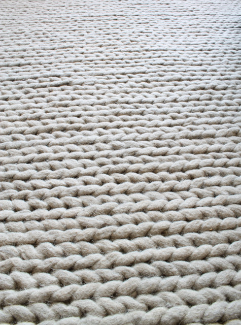
It looks like a giant knitted sweater! I LOVE it! So far it’s shedding a little bit, but nothing too bad. It looks like it would be squishy, but it’s actually quite firm. It feels great underfoot and I sprayed the heck out of it with Scotch Guard, so hopefully I can keep my maniac children from ruining it.
*** UPDATE: Don’t buy this rug if it will be in a room you use. It’s a nightmare to vacuum and kid crumbs go into the holes in the braiding, making it impossible to clean. It sheds, it’s getting big tufts of fiber that stick up and unravel. It is not family friendly!
I finally upgraded my college apartment torch lamp to this vintage beauty:

I bought it from a local Facebook selling page. Isn’t it perfect next to the vintage suitcase end table?
One more pretty pic, just because:
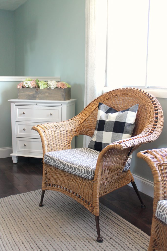
I’ve been debating painting or staining the wicker chairs. Would you? If so, what color?
And now, last but not least, let’s do some before-and-after shots!
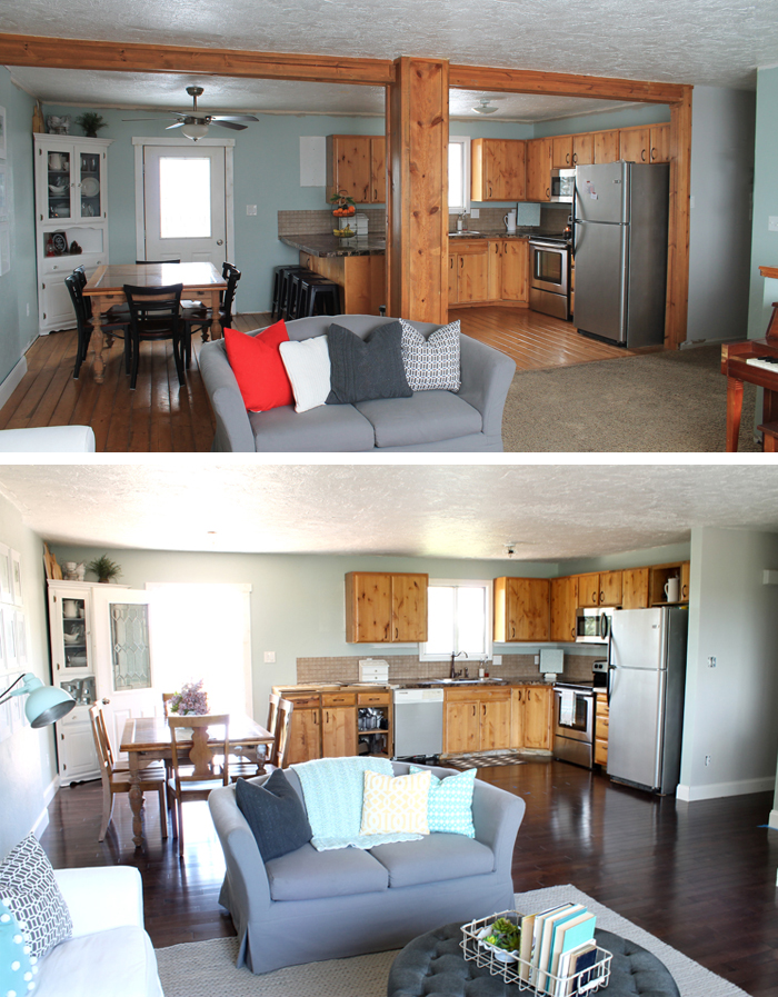
Wow, if you’re still hanging with me through this mega-long post, you are a champ! This was by far the most invasive remodeling project we’ve done yet. Honestly, it was hard on our family! That’s one of the reason we’re going to wait a while before working on the kitchen. We’re pooped and need to spend some quality time as a fam before we tackle any more big projects. Of course I’m itching to finish the kitchen (I mean, I have no countertops in spots, I’m missing cabinet doors for crying out loud and wowsers, the old wood looks especially ugly next to the new flooring!) but family first. We’ll resume remodeling craziness when we feel like we’ve caught our breath.

Comments & Reviews
Love it, Jennifer!! I can't wait to see it in person someday!! You guys have been so busy, and you did a beautiful job. Amazing transformation.
Thank you Emily! Muwahh!
Oooh!!!! I love it!!! Can't wait to come see it!
Thanks girl!
Beautiful! I like the wicker the color it is. It adds some warmth.
Thank you, Amy! I like the warmth of the wicker too, so we'll see if I change them or not. They kind of stick out in the room, but I'm not sure if it's a good thing or not.
It's awesome! I love it!
What an amazing transformation! I love the wall color & decor! The wicker chair is beautiful. I would personally leave it as is 🙂
Wow!It looks great!
What paint color is one the walls?
It is Sherwjn-Williams Rainwashed.