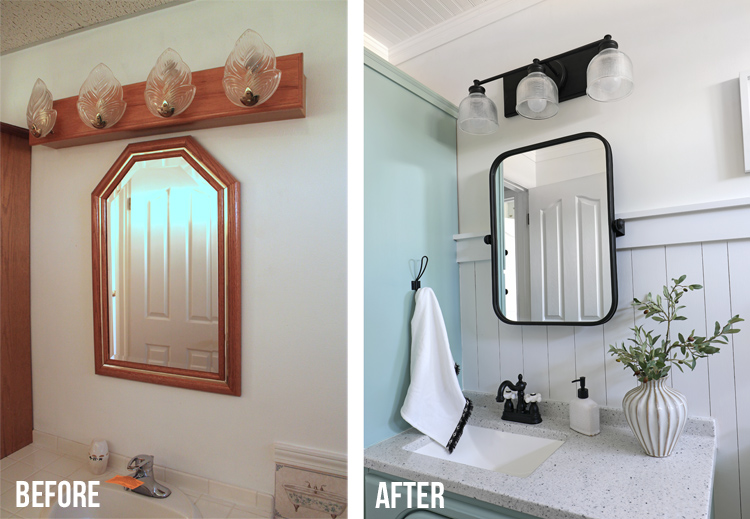
This dated, boring bathroom got a much needed update with a new vanity top, new lighting, new mirror and lots of paint + hard work!

You guys, I’m super proud of this freshly remodeled bathroom. Unlike many of the other spaces in our home that my husband and I have tackled together, I did this space almost completely by myself! I have been trying to challenge myself to use power tools and do more of the actual building and I did just that in this bathroom. My husband helped me push big sheets of material through the table saw, helped install the ceiling (definitely a two person job) and he helped with a few odds and ends, but I did about 95% of this space on my own and I’m feeling like one tough chick right now.
To fully appreciate how far this space has come, let’s look at a before picture.
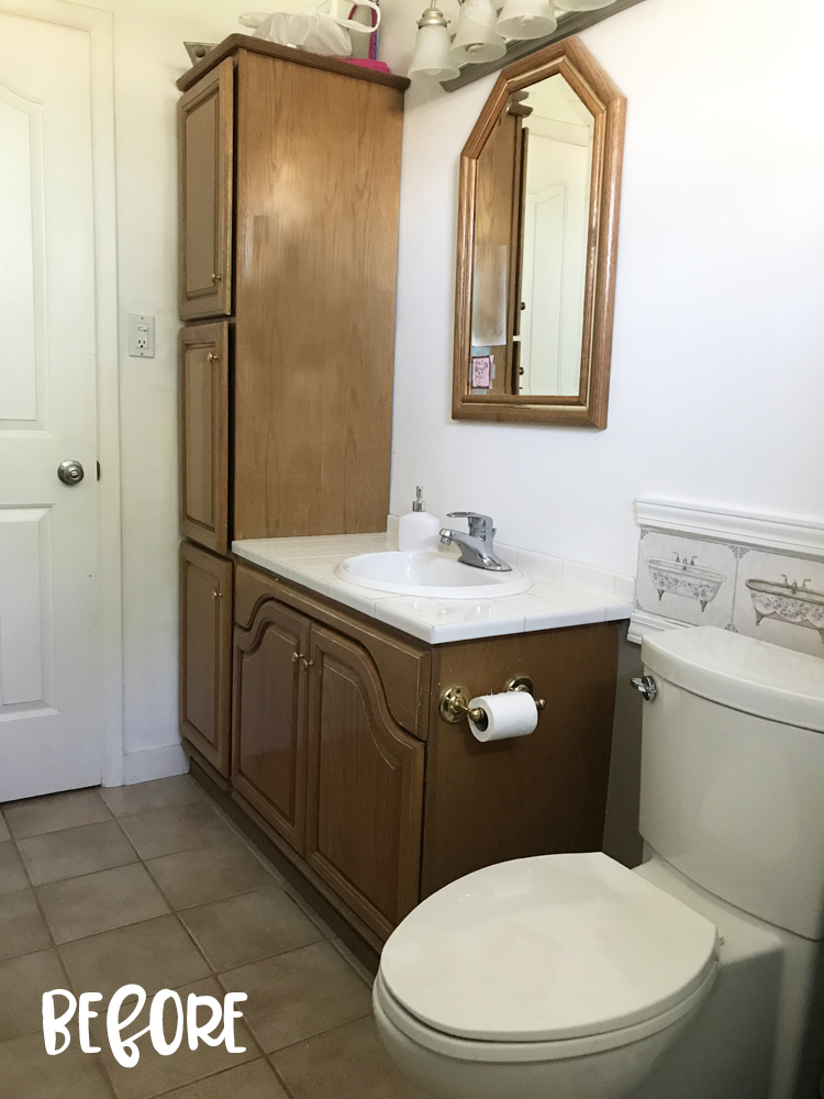
Eek! The orange oak vanity and matching mirror are straight outta 1998 and the wallpaper border with the bathtub motif… well, that really had to go.
The tile floor is the same tile that runs through the entire basement and it is still in good shape, so I didn’t want to replace it. I also decided to keep the existing vanity cabinet because it functions well and new vanities are stupidly expensive, so paint to the rescue!
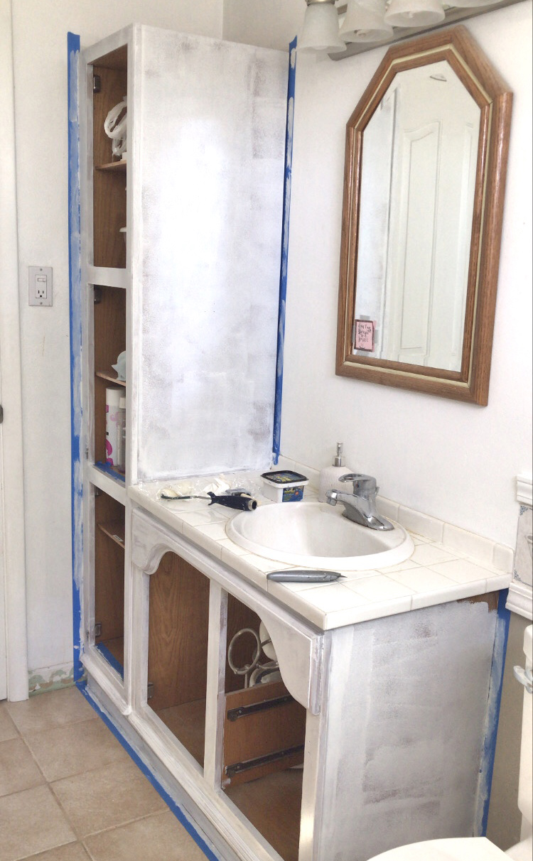
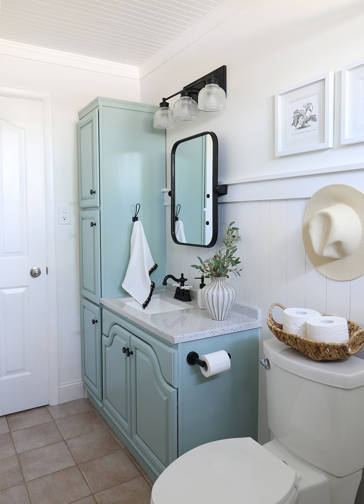
I will always tell you to sand and prime before painting. Even though it adds extra work, you will regret it if you skip those steps. I used the best paint for cabinetry, which I wrote about in detail here, and it worked beautifully. The cabinet color is Sherwin-Williams Halcyon Green and I would describe it as a blue-green-gray hybrid color that morphs based on the light. It’s super beachy and refreshing and I love it in this bathroom.
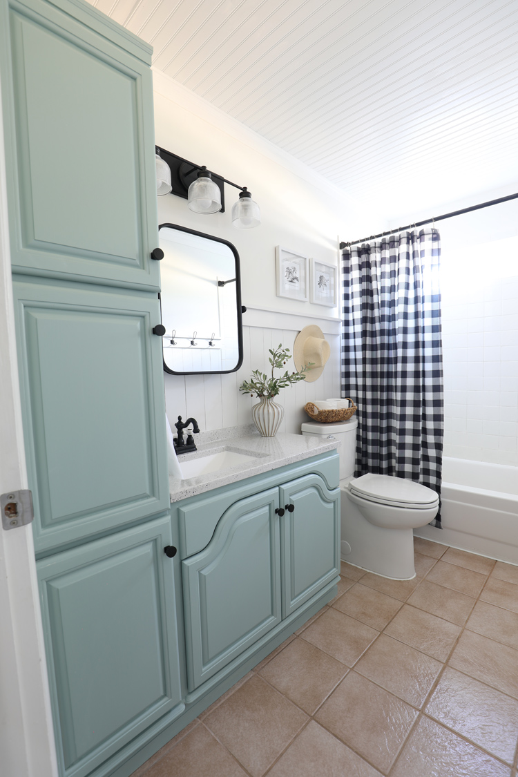
I replaced the vanity top with a new solid surface top. This vanity is only 19 inches deep, so it was a real challenge to find something that fit. I ended up buying an entire vanity (cabinet and all), using just the countertop and selling the cabinet base online.
I switched out the faucet for this darling black and white faucet with vintage knobs. I’m crazy about it. Like, I never knew I could love a bathroom faucet so much… but I do! It adds the perfect whimsical touch.
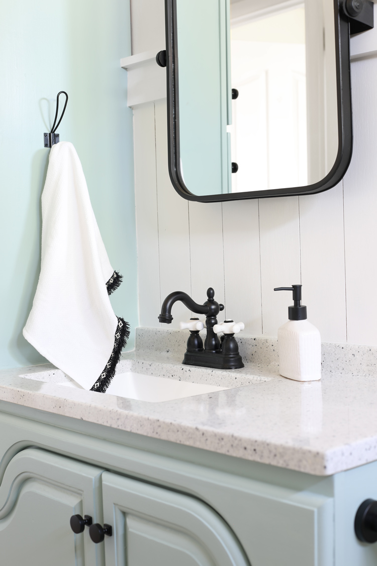
Another big upgrade was applying a vertical shiplap wall treatment.
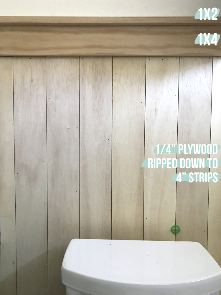
I cut a 1/4″ plywood sheet down into 4 inch wide strips, then attached them to the wall with Liquid Nails and the pneumatic nail gun. Each strip is 4 feet long. The top trim is a 1×4 board with a 1×2 board turned sideways on top of it. I love the clean look of the square angles and think it adds so much charm and interest to the bathroom. If I were to do it again, I would prime and paint the wood before installing.
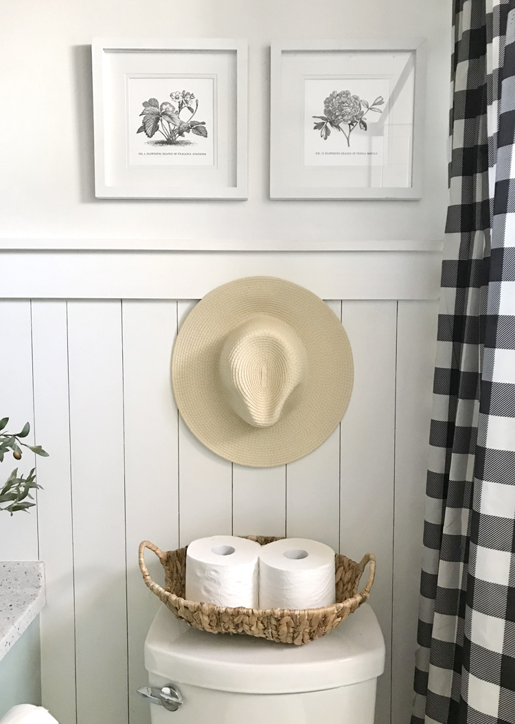
I framed two black and white botanical prints in frames I’ve had for years and hung a favorite hat to add some warmth to the space. The buffalo check shower curtain is maybe a year old, but I love the black and white in this space.
Because I decided to run the wall treatment behind the vanity, I had to find a mirror that could sit away from the wall enough to clear the lip of the trim. This rounded corner tilting mirror was just what I needed. It actually stuck out from the wall too far, so my husband trimmed the metal support pieces back a little to make it fit perfectly in our space.
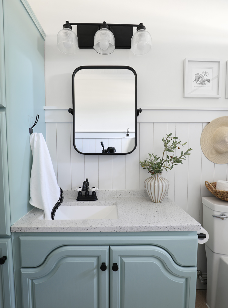
We also switched out the bathroom vanity light for a more modern vibe. I routed the edges of a piece of wood, painted it black and mounted the light on top so that it would stick out from the wall far enough that the light would clear the mirror. Adding the larger mount also allowed me to center the light on the vanity instead of being forced to mount it exactly where the electrical box was.
The last thing I changed in the bathroom was removing the drop ceiling and replacing it with a beadboard ceiling. That old drop ceiling was gross and gave off “hotel-where-you-might-get-murdered” vibes. Ew!
The new ceiling just adds to the fresh cottage feel of the space.
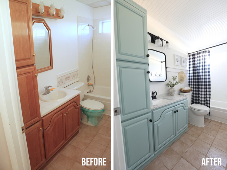
Isn’t it amazing to compare the space before and after? It has a completely different feel and I am so, so pleased with how it all came together. Thanks to Wayfair for the challenge to keep me motivated to get this space done!
Source List
- Bathroom Light in Matte Black
- Tilting Mirror
- Faucet with White Ceramic Knobs
- Vanity Paint – Color is SW Halcyon Green
- Wall Paint – SW Extra White
- Vanity Top
- Cabinet Knobs
- Toilet Paper Roll Holder Matte Black
- Towel Hooks
- Shower Curtain
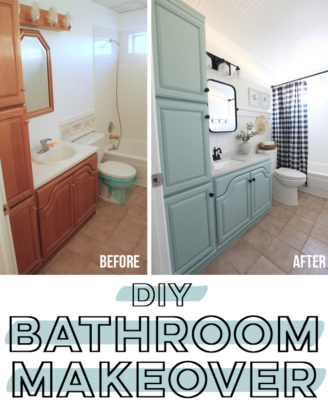
Like this project? Pin it so you don’t forget it!

Comments & Reviews
OMG, it is truly beautiful.
Thank you so much Joyce! You always cheer me on!
So, so good! It’s gorgeous and totally is you! You rocked it 🙂 I also loved watching to process on you IG stories. So fun!
This is amazing! I loved watching the transformation on your stories! You nailed it!
That is a fabulous makeover! Wow!
Beautiful!
Love love love it!
My bathroom looks exactly like the before picture……lol
WOW you did a great job.
I love the fact your project is in a bathroom with almost exact dimensions and layout as mine. Although the cabinet doors are the only actual wood, i now have hopes of a radical new look without a radical punch to the bank account!!